
Nationwide
On Your Side
On Your Side
Nationwide is not a bank. It is and always has been a building society with a community of over 15 million members. A brand that needed to remind the market about its people focused roots and inclusive approach.
We set out to create and deliver a new customer focused brand proposition that was both ownable and differentiating in a crowded market. The resulting expression bringing a more human personality to this loved British brand.


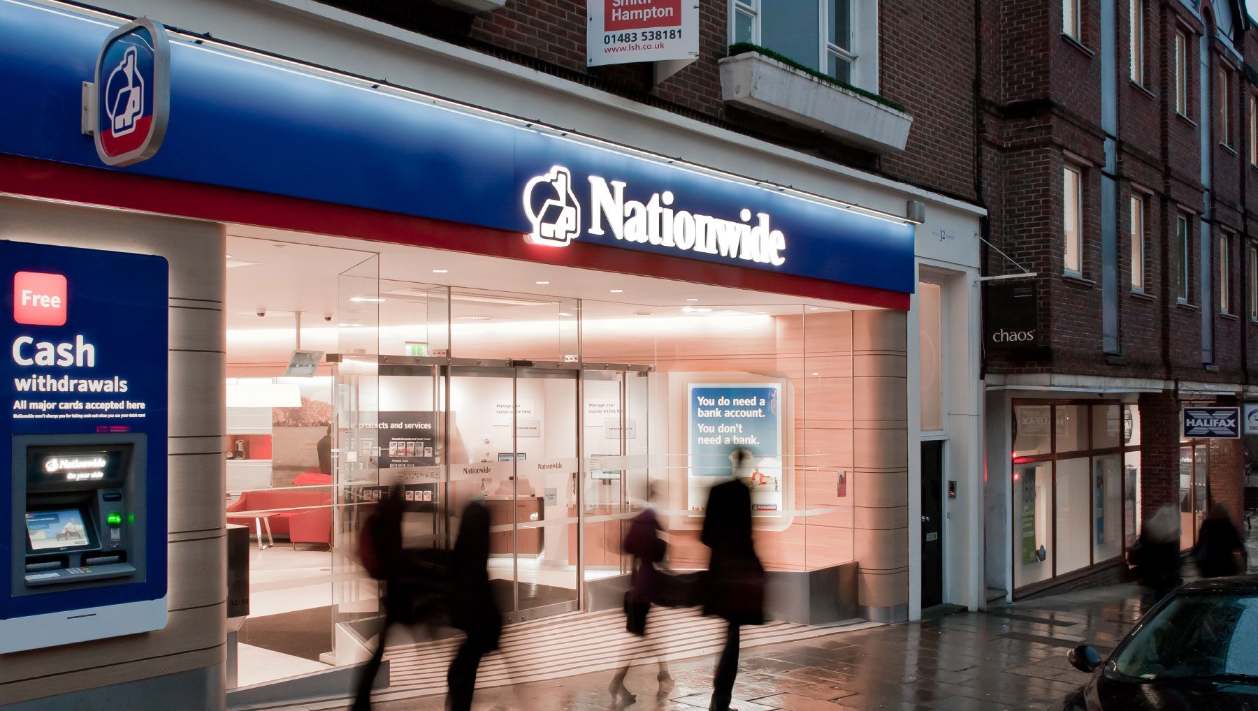
You do need a bank account. You don’t need a bank.
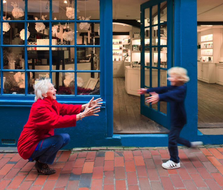
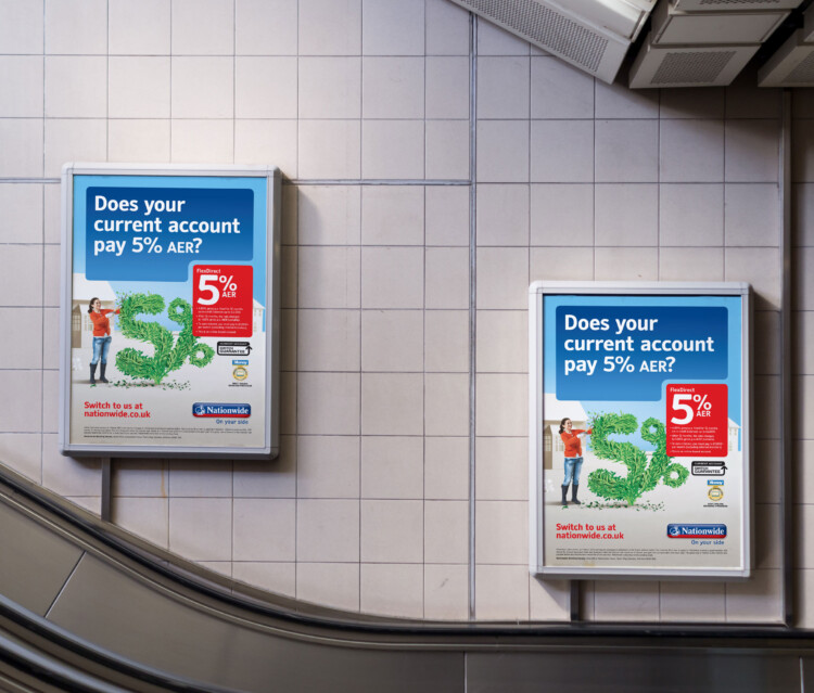
A new suite of photography was created to aid visual communications and enhance brand recognition. Real people represented in a world of blue, with just a touch of red. The style was adopted across campaigns and products as well as being applied across the branch network.
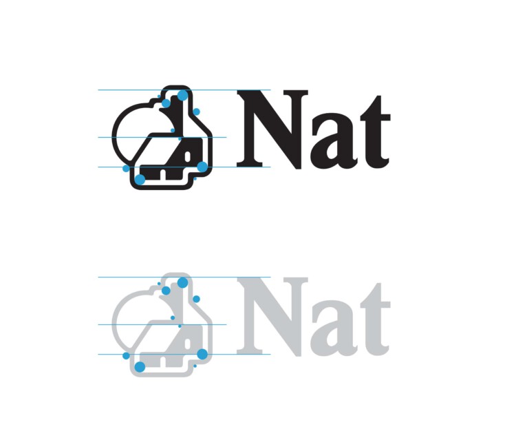
A fresh look at an icon.
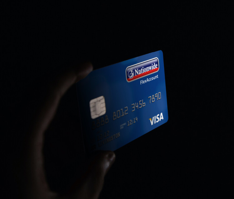
The brand icon was redrawn, or rather smoothed off to visually soften the edges. A longstanding image across British high streets, the mark could not be disregarded so the colouring and form were enhanced to bring it up to date for a younger audience whilst remaining recognisable to long standing customers.


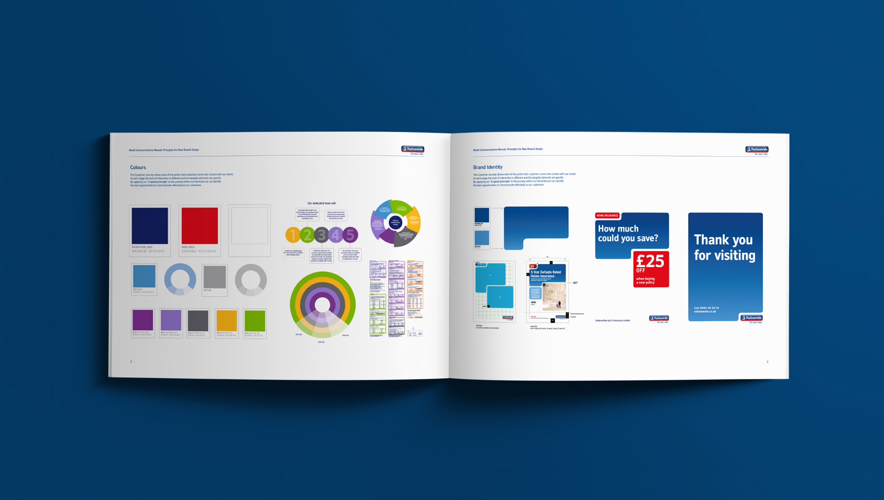
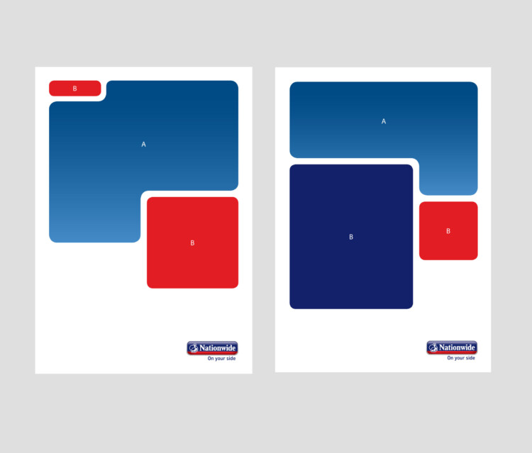
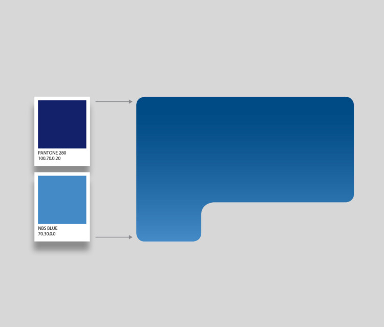
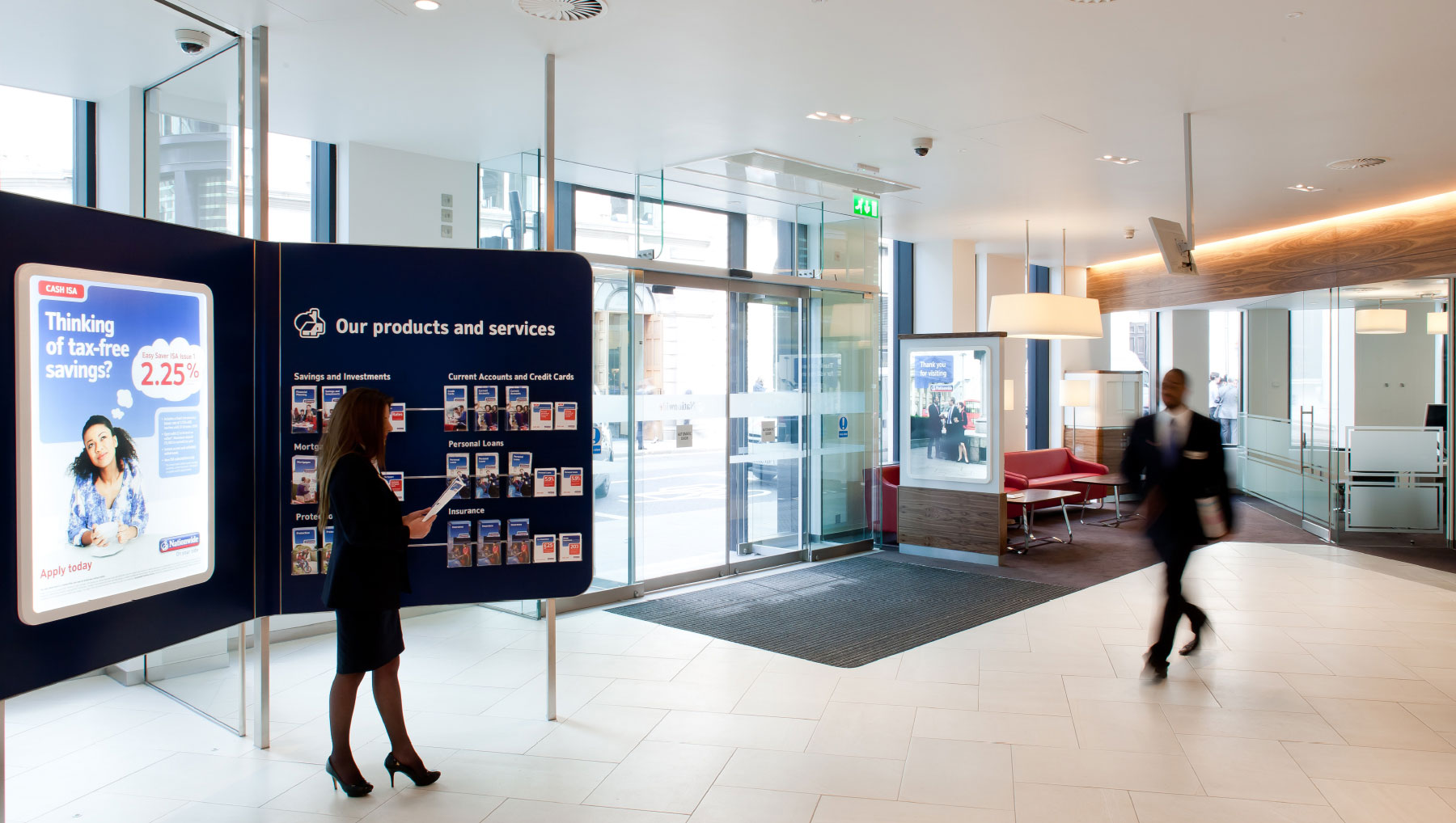
A new visual language
The core brand assets and colour palette were softened and enriched to better reflect the underlying warmth of the brand. Delivering a stronger visual representation of the core positioning. ‘On your side’
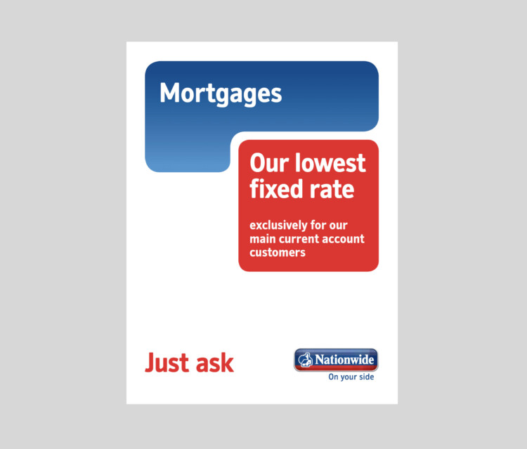
Consistent application
One defining brand story was brought to life across all applications, environments and touchpoints to ensure the brand message was loud and clear – Nationwide are on your side. Following this brand refresh, Nationwide saw a 20% increase in new accounts within the first nine months.
“Since working with I-AM, Nationwide is being adopted by more and more key customers as their core financial provider. The new brand design is a great success and is being rolled out across our network.”